

So Long, Farewell 2023. Godspeed.
Welcome 2024. Don’t forget to pack the luck. If you do that, we won’t forget you.
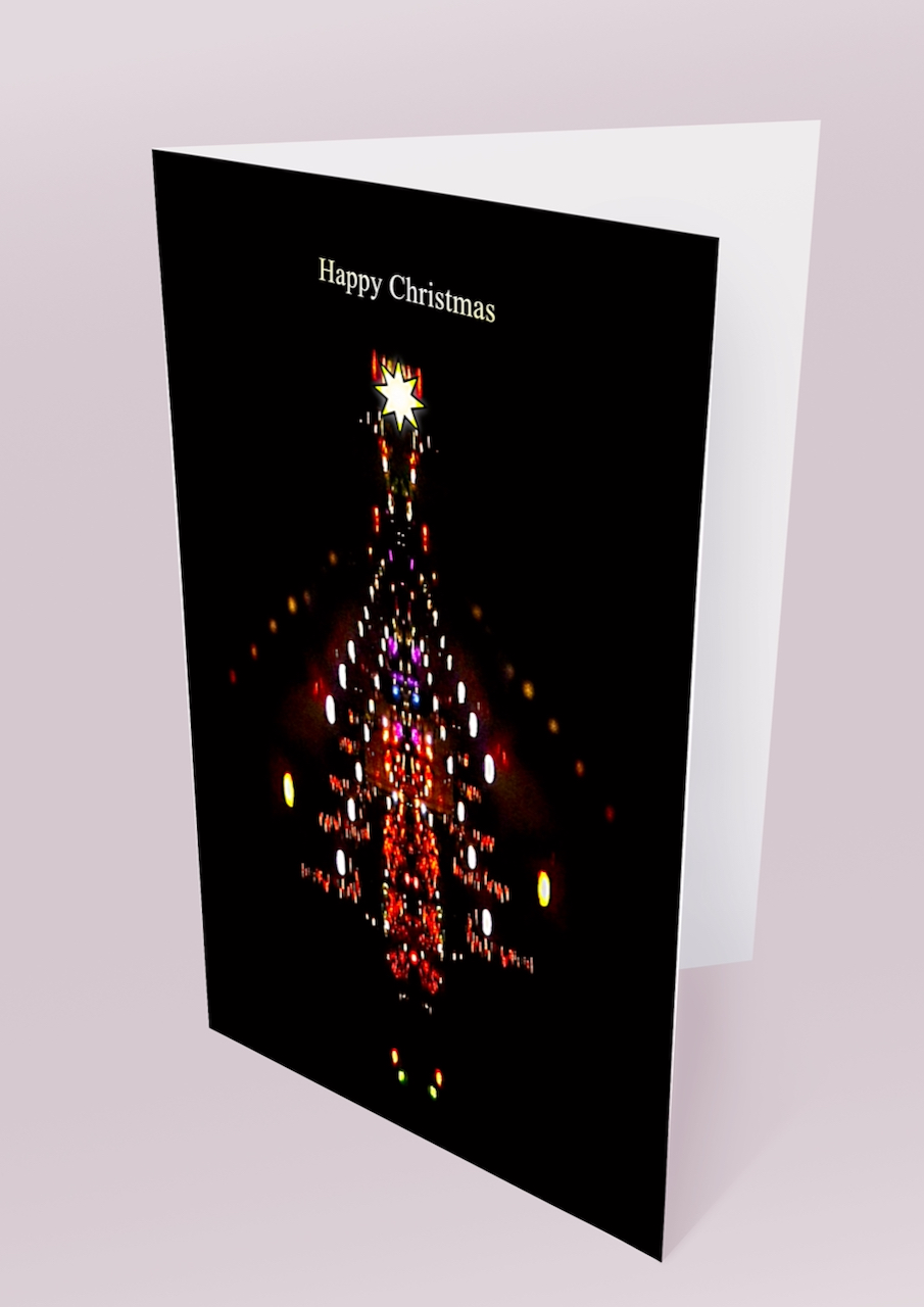
This is the Christmas card I designed and sent this year (2023).
So Long, Farewell 2023. Godspeed.
Welcome 2024. Don’t forget to pack the luck. If you do that, we won’t forget you.
This is the Christmas card I designed and sent this year (2023).
This is an eight minute long emotional punch. But I can’t decide whether I feel euphoric or melancholic when I listen to it. Whichever it is, it moves me.
Allegri’s ‘Miserere mei, Deus’ (Have mercy on me, God) is a piece of renaissance sacred choral music by Gregorio Allegri. It is a setting of the Latin version of Psalm 51 from the Bible.
Pope Urban VIII commissioned it in 1638. It was performed exclusively in the Sistine Chapel at the Vatican during matins and lauds for the last three days of Holy Week.
The piece is a nine-part polyphony composed for two separate choirs, one for four voices and the other for five and consists of a slow, prayerful melody with a solemn, plaintive texture.
Because of its perfect blend of harmony, complex counterpoint, and sublime emotion, it is one of the most beloved and iconic works of renaissance choral music.
The bit that grabs you is the soprano reaching the soaring high C; it’s the audio version of a stab at the heart, but you wouldn’t have heard that in the chapel. We’re hearing that high C because Felix Mendelssohn’s transcription error made it a fourth higher. It’s an accidental blessing.
The 14-year-old Mozart is credited with transcribing it. This is almost certainly untrue. Mozart memorised it and created his own version, commonly referred to as ‘Mozart’s Miserere’, but it’s not as good as the original or the one with Mendelson’s transcription error.
There’s an excellent version by Tenebrae Choir with a fine performance video, and you can see it here https://youtu.be/H3v9unphfi0

Let’s say cheerio to 2022.
Glad to see you on your way.
Welcome 2023. You get to clean up all of 2022’s garbage.
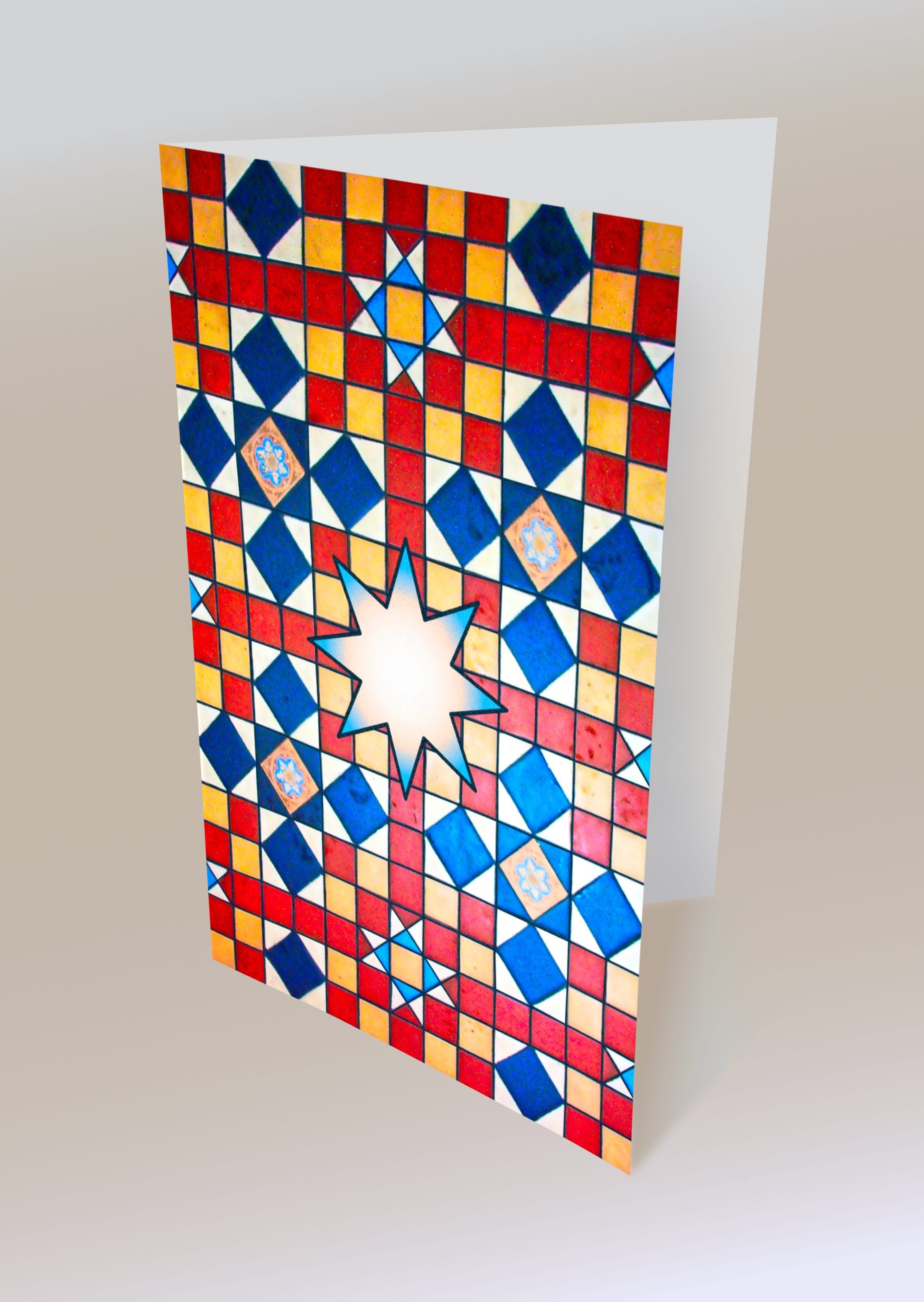
This is the Christmas card I designed and sent this year (2022).

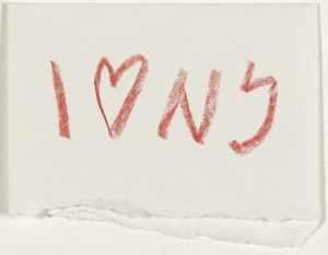
Milton Glaser designed this in the back of a New York cab with a crayon.
Glaser’s work is characterised by its bold use of colour and its playful style. The typeface is “American typewriter”. It’s a typeface I will rarely forgive you for using, but it’s just the kiddie here. To make that typeface charming is something that only a great idea can do.
His love for New York City is evident in his work, which often features the city’s skyline or iconic landmarks. He has also designed several posters and other graphics to promote the city.
Museums and galleries worldwide have featured his work. And he has been recognised with numerous awards, including the National Medal of Arts.
This particular symbol has been copied in other cities all over the world. And if you come back from one of these places with a souvenir that has ‘’I ![]() another place” on it, you’ve bought a second-hand idea, and we can never be friends.
another place” on it, you’ve bought a second-hand idea, and we can never be friends.
Because I’m a designer who ![]() Milton Glaser’s whimsical cleverness.
Milton Glaser’s whimsical cleverness.
Somewhere on the other side of Saturn, a small device hurtling through space took this picture.

The Cassini Orbiter has taken thousands of pictures, all fascinating to scientists, particularly astronomers and astrophysicists.
But this one is special – this one is beautiful. This one is for the rest of us – the poets and artists among us.
Look at how the rings scatter the sunlight when Saturn eclipses the Sun. A soft golden glow illuminates the dark side of the planet.
Do you see that small pale dot above and towards the left of the brightest ring? That’s no spec of dust; that’s where we live; that’s Earth. It’s where the Cassini Orbiter started its journey. And it’s where you are now looking at this picture.
We could not have imagined this picture for ourselves. It took those fervent dreamers, those visionaries, the curious, idealistic seekers of knowledge and understanding, those ‘artists’ to make it real for us. So, shine on you scientists and engineers. Work your millions of tiny marvels to create technology that extends our reach so very far.
Meanwhile, we can nourish our inner nerd and boldly geek out at http://saturn.jpl.nasa.gov
This fresco in the Sistine Chapel depicts Adam receiving the spark of life from God.

But what we don’t see is the story we heard, where God breathes life into a clay effigy of a man. Why are we not seeing the golem spell described in the Book of Genesis?
When you’re so talented that nothing is beyond your ability to paint, Michelangelo seems to pull his punch here – choosing to be deliberately ambiguous.
Did he doubt the story?
In 1990 Frank Meshberger, a doctor from Indiana, thought that the red cloth, along with the characters behind God, appeared to have been based on a brain’s anatomy. And he wrote about this observation in more detail in the ‘Journal of the American Medical Association. A bit of an overclaim, I think, but that blanket behind God is remarkably similar to a brain cavity of a dissected human cranium.
We know that Michelangelo did dissections and would have known the shape of a human brain, but he must have used the brain cavity in this painting for a reason.
Adam seems bored, that’s his maker there, and he doesn’t seem to be overjoyed by God’s presence.
He’s daydreaming. Some of your best ideas will happen when you’re daydreaming; you can think up the strangest things.
Maybe the creator here is Adam, and what he created was the idea of God.
And that would mean that what you see here is Western culture’s first thought bubble.

Maybe?
You have to be very careful with humour. Sometimes it’ll not come over well.
Santander using Ant & Dec is an excellent example of it working well, especially with a bank.
After the financial collapse of 2008, don’t we want banks to be careful, trustworthy and small c conservative? A bank has no business being creative.
I recently discovered another product with some humour on the label. It’s a wine, something people take pride in developing an ‘educated’ palette with.

If you’re going to pun, be brilliant about it. This one suits the product. And if you’re a goth, you can find a little red tipple to go with your deep black-hearted darkness.
Don’t have too much because you’ll need to watch out for those bats in the belfry.
Enjoy.
I was looking at the BMW Isetta that I did earlier, and it struck me that I had paid too much attention to the colours when what I liked about that car was the form. So I decided to take all the colours away and only use black and white with no shading. Just to see if the form alone would still make a compelling image.
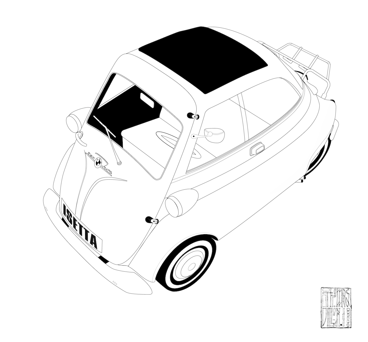
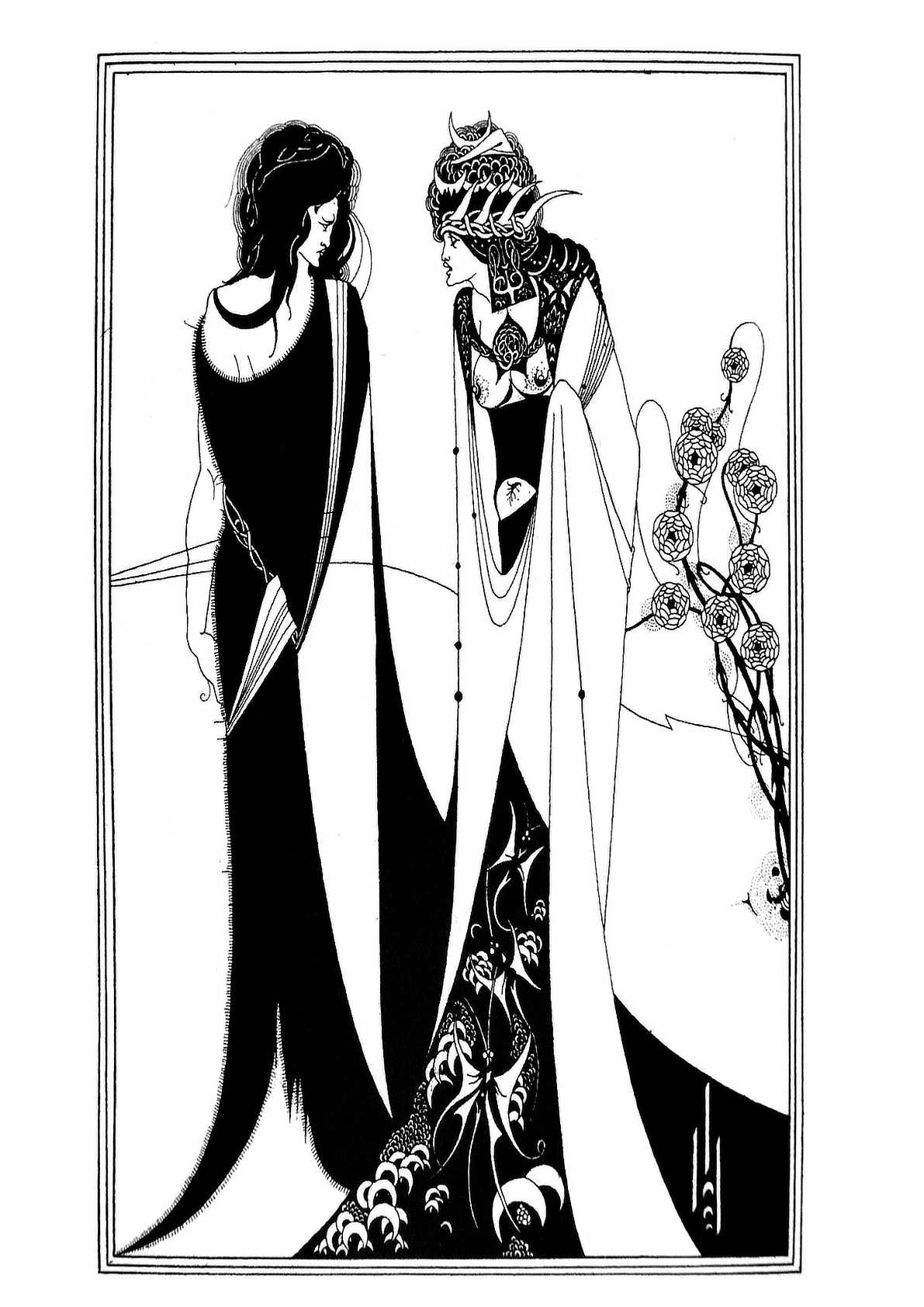
And it did. Because I ended up with an image that evoked Aubrey Beardsley’s very graphical illustrations. However, a german car (even one as cute as the Isetta) is still very ‘form follows function’ and not the slightest bit decadent, romantic or organic, so I looked for something that would suit his approach more.
The Hagstrom Viking, with its sweeping curves and organic form, was a subject more in keeping with Beardsley’s distinctive and luscious style. I adapted it as I did the BMW Isetta illustration.
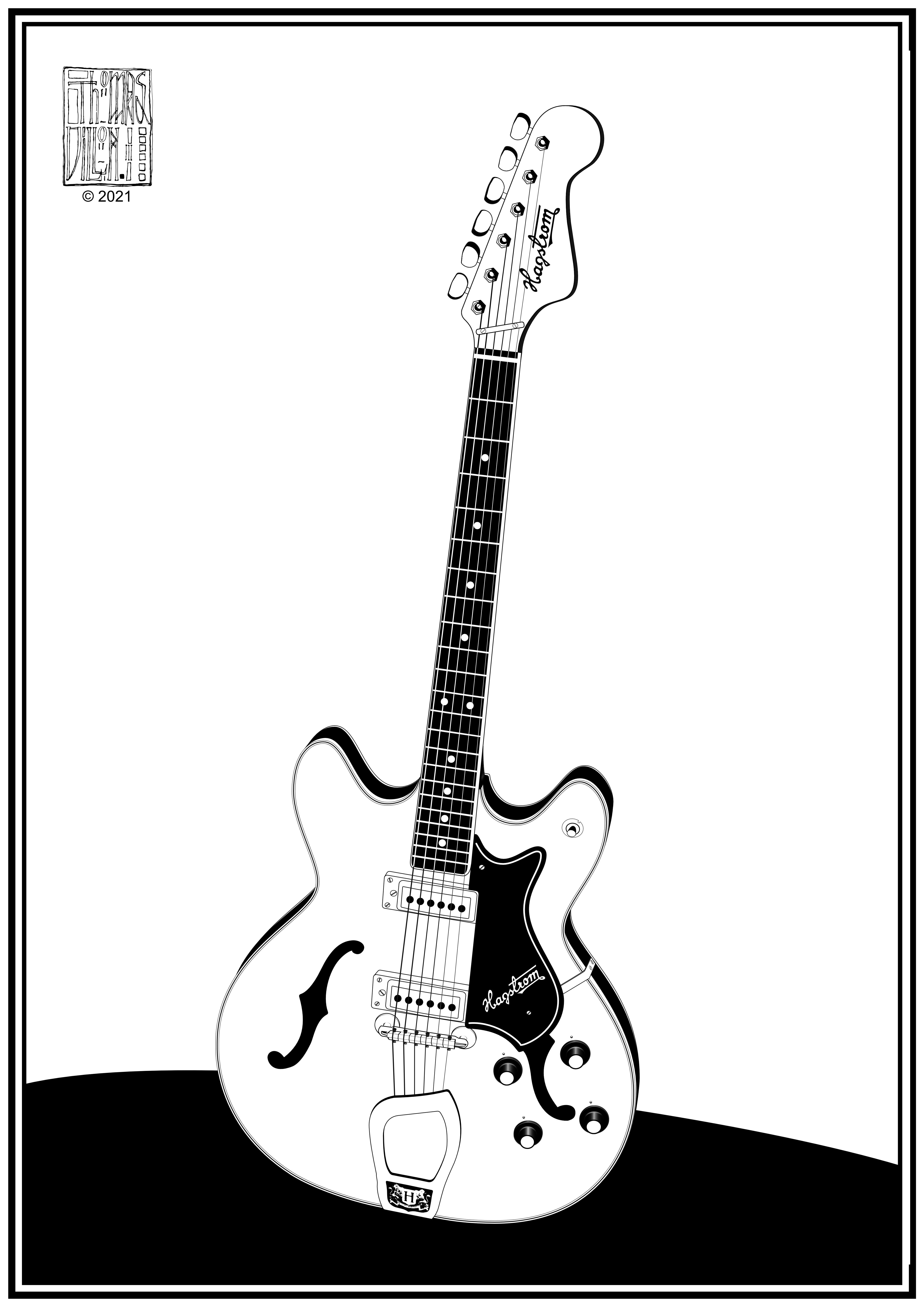
If Aubrey Beardsley did guitars.
Thank you, Mr Beardsley, for not being at home to Mr Grey.
You can see some of Aubrey Beardsley’s work here https://en.wikipedia.org/wiki/Aubrey_Beardsley

Social Distancing by a Californian computer corporation.
with a healthy refurbished logo.
There’s a truism in art that the hardest thing to do is recognise when you have finished.
But with digital artwork like this, I don’t think it’s true because absolutely nothing is committed to the work. Everything can be command zeded (![]() +Z) to a blank page and then shift command zeded (
+Z) to a blank page and then shift command zeded (![]() +
+![]() +Z) back to the latest mark you made. The errors and compromises you commit in traditional art will, in due course, deliver a signal that says, ‘You arse! You’re only making it worse now’. This is why in digital art, you never know when you’ve met the peak of the artwork or passed it and started the descent.
+Z) back to the latest mark you made. The errors and compromises you commit in traditional art will, in due course, deliver a signal that says, ‘You arse! You’re only making it worse now’. This is why in digital art, you never know when you’ve met the peak of the artwork or passed it and started the descent.

This Isetta was like that; there was no point at which I saw the downturn. It just got better and better with each step I took. But the more steps toward ‘perfection’ I took, the more I noticed things that needed a tweak.
In the end, you have to know when each tweak is making a barely noticeable difference, that it’s almost pointless doing it. You could spend days doing this, and if you find yourself in this situation, you have finished. You finished a long time ago.
But for the completionists among you, there’s a story that at an exhibition at the Royal Academy, J.M.W Turner saw one of his paintings and got out a brush and some paint and started amending the piece where it was hanging.
If that story isn’t true, I’d be disappointed. There is hope for all us arty fidgeteers. For a genius, nothing is ever finished – they are deaf to the singing fat lady.
