A homage to Aubrey Beardsley.

Illustration, Vector

I was looking at the BMW Isetta that I did earlier, and it struck me that I had paid too much attention to the colours when what I liked about that car was the form. So I decided to take all the colours away and only use black and white with no shading. Just to see if the form alone would still make a compelling image.

Line illustration of a BMW Isetta. In the style of Aubrey Beardsley. Solid black on white with no intermediate greys. Darker areas are solid black.
Aubrey Beardsley – he don’t do no shading!
John the Baptist and Salome by Aubrey Beardsley

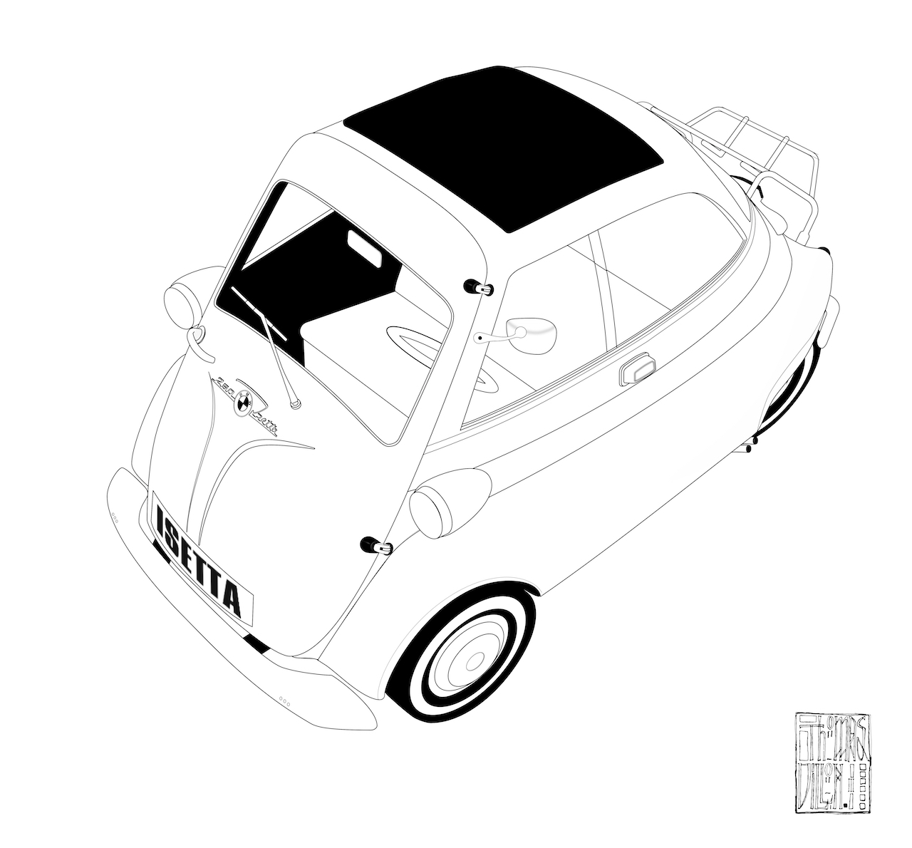
And it did. Because I ended up with an image that evoked Aubrey Beardsley’s very graphical illustrations. However, a german car (even one as cute as the Isetta) is still very ‘form follows function’ and not the slightest bit decadent, romantic or organic, so I looked for something that would suit his approach more.

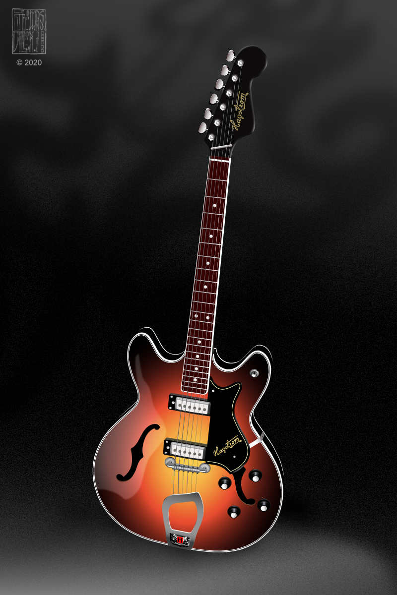
The Hagstrom Viking, with its sweeping curves and organic form, was a subject more in keeping with Beardsley’s distinctive and luscious style. I adapted it as I did the BMW Isetta illustration.

Aubrey Beardsley's Viking. A Hagstrom Viking semi accoustic guitar vector drawing in stark Black and white with no midtone gray
Aubrey Beardsley’s Viking.

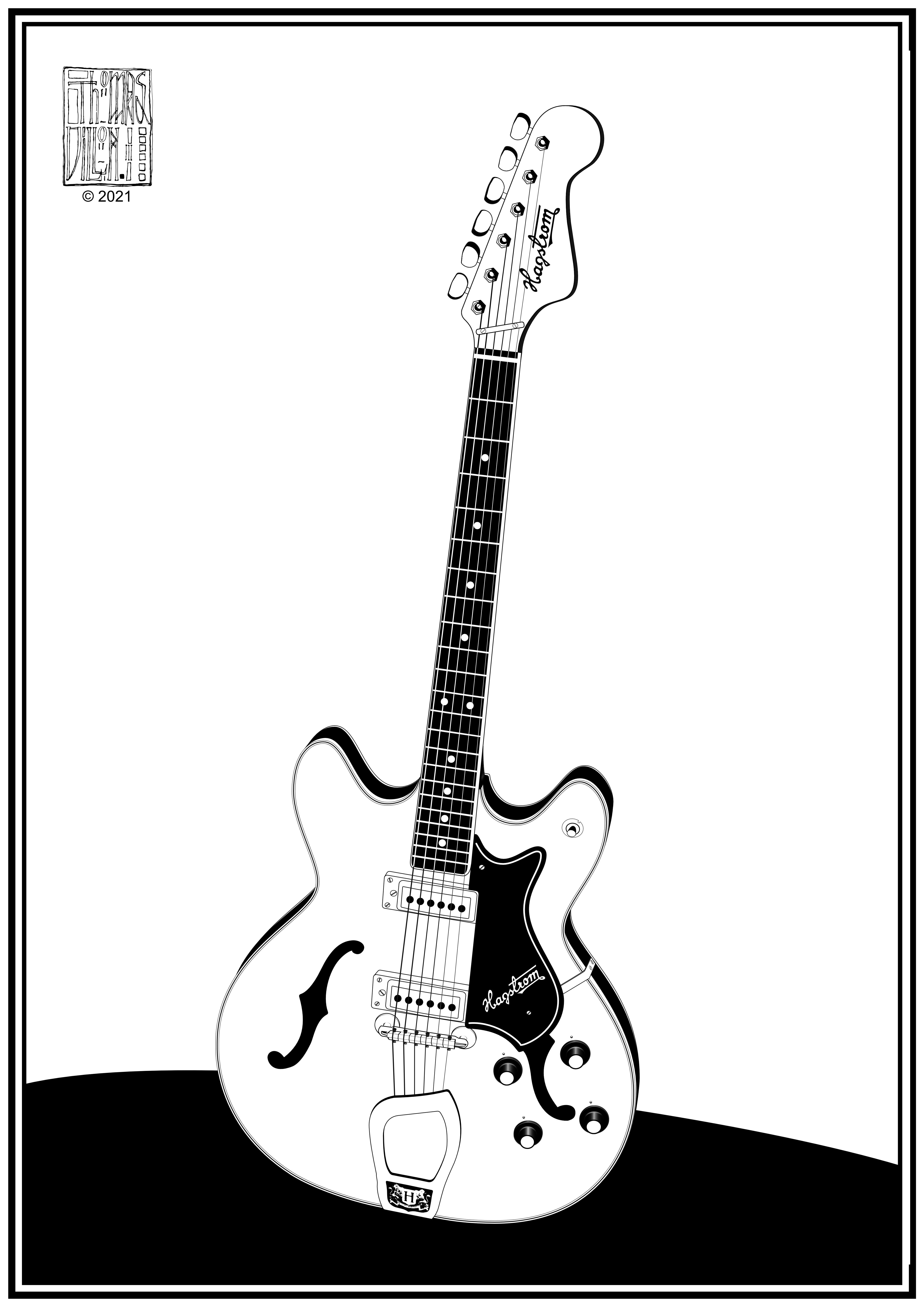
If Aubrey Beardsley did guitars.

Thank you, Mr Beardsley, for not being at home to Mr Grey.

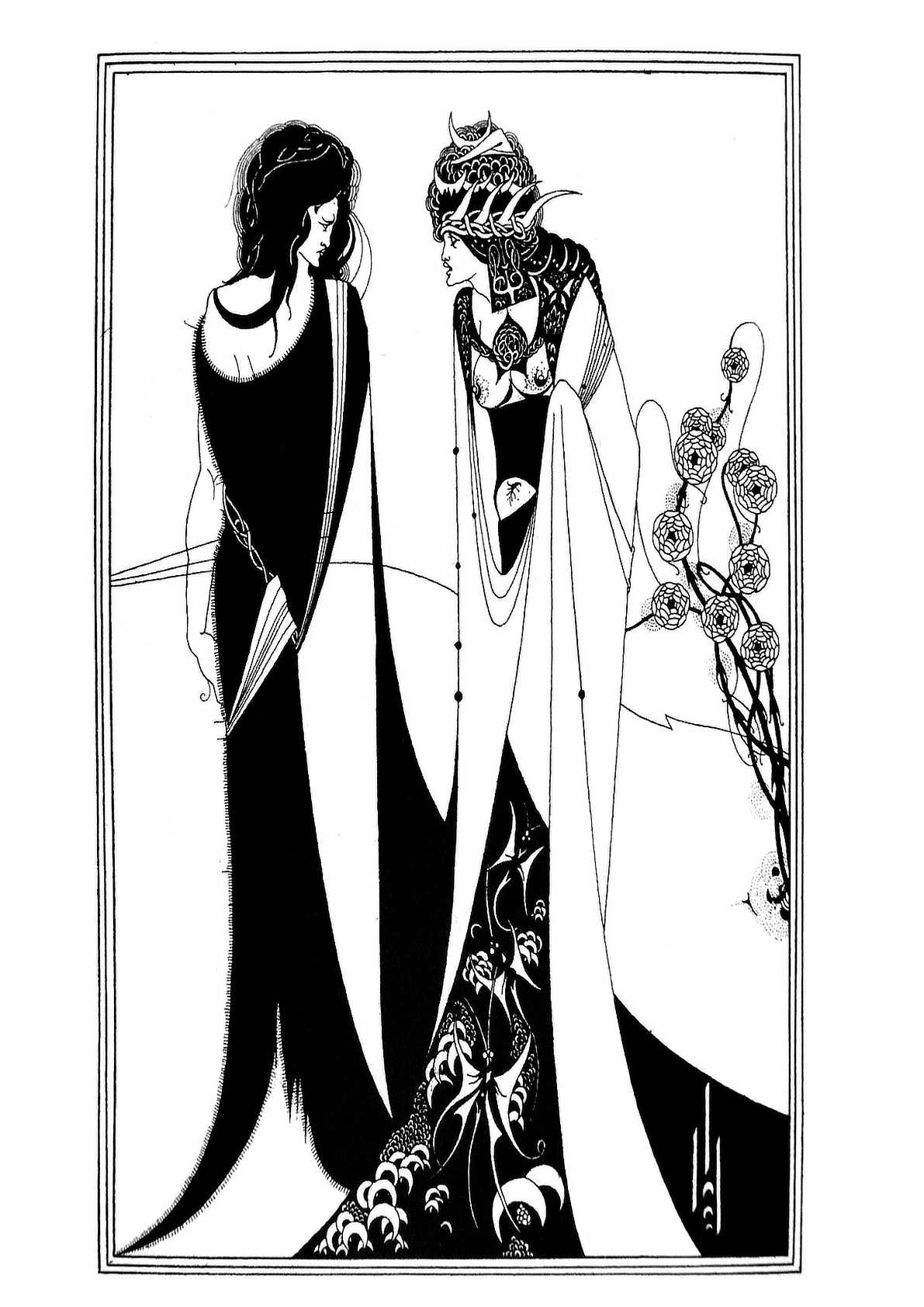
You can see some of Aubrey Beardsley’s work here https://en.wikipedia.org/wiki/Aubrey_Beardsley

The Complete Unfinished BMW Isetta.

Illustration, Vector

There’s a truism in art that the hardest thing to do is recognise when you have finished.

But with digital artwork like this, I don’t think it’s true because absolutely nothing is committed to the work. Everything can be command zeded (+Z) to a blank page and then shift command zeded (++Z) back to the latest mark you made. The errors and compromises you commit in traditional art will, in due course, deliver a signal that says, ‘You arse! You’re only making it worse now’. This is why in digital art, you never know when you’ve met the peak of the artwork or passed it and started the descent.

Orange and primrose yellow Bmw Isetta. This is a model. But with plastic mirror, windscreen wiper and door handle missing and the luggage rack at the back bent and twisted, I finished it by refering to photos of a real isetta.
This is a model. But with plastic mirror, windscreen wiper and door handle missing and the luggage rack at the back bent and twisted, I finished it by referring to photos of a real Isetta.

This Isetta was like that; there was no point at which I saw the downturn. It just got better and better with each step I took. But the more steps toward ‘perfection’ I took, the more I noticed things that needed a tweak.

In the end, you have to know when each tweak is making a barely noticeable difference, that it’s almost pointless doing it. You could spend days doing this, and if you find yourself in this situation, you have finished. You finished a long time ago.

But for the completionists among you, there’s a story that at an exhibition at the Royal Academy, J.M.W Turner saw one of his paintings and got out a brush and some paint and started amending the piece where it was hanging. 

If that story isn’t true, I’d be disappointed. There is hope for all us arty fidgeteers. For a genius, nothing is ever finished – they are deaf to the singing fat lady.

Ford Capri

Illustration, Vector

I drove my Capri to ‘vector school’.

And I learned that adobe Illustrator still has some advantages that affinity designer lacks. 3-D and perspective would have made drawing this easier. However, Affinity Designer doesn’t screw you with an extortionate and exploitative subscription fee.

You can still get the same results with Affinity Designer without the shortcuts and tools that Illustrator has. I used Affinity Designer for this image.

What a beautiful thing a Ford Capri is.

Vector Art for Hagstrom Viking

Design, Illustration, Vector

I’ve discovered a better way of using vectors. Look at this image.

A semi acoustic electric guitar with a sunburst finish from yellow in the centre to red then black at the edge.

It’s all vector. Rendered into jpg.

But look at the difference this new technique makes. It’s a reliable method that keeps vectors all smooth with no kinks. The image on the left was how I did the work but it took ages, just tweak, after tweak after tweak.

Fewer nodes make smoother curves.

It all depends on placing the node at the kiss point of a peak or a valley of the curves and keeping the toggles 0° horizontal and only extending them horizontally.

The same method works with width for inward and outward curves but extend the toggles vertically at 90°

This discovery has been an absolute boon for me.